Items
-
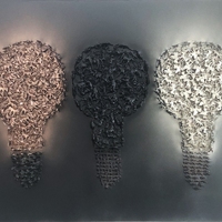
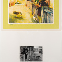
Hope
This piece is a combo of 400+ toy animals, soldiers and dinosaurs; inspired by the feeling of not having hope. You don’t know what someone’s going through, even if you’re close. Each light bulb represents a life and are all different from the colours to the combination of toys. The middle light bulb blends in with the dark background to visually represent not having hope, feeling lost. However once exposed to true light and darkness, parts of it glow. This relates back to my roots/routes because of the message it represents. When you struggle throughout your life, it’s a reminder that through those dark times, you can come out stronger than before, so don’t lose hope. Remember, the stars don’t shine without the darkest sky. -
-
-
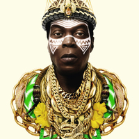
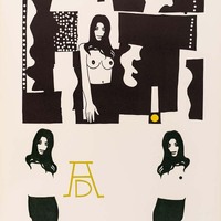
When the Fam Lose the Faith Lift Them Up
From the series "Holding Space". In this body of work Adeyemi Adegbesan explores the double entendre of minority bodies holding their space physically and figuratively in a Eurocentric world. -
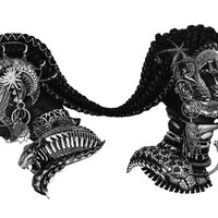
EBO'ZHE
A series of artworks inspired by West African mask-making traditions, interstellar vessels, and various hybridized forms. From the series "Building Black Amorphia." -

-

Concept illustration, Seneca@York Campus, Computing Commons
Guanghao Quan produced concept illustrations for Moriyama & Teshima Architects during their design of the Seneca@York Campus. Opened in 1999, the campus is home to programs in the Faculty of Communication, Art and Design and the Faculty of Applied Science and Engineering Technology. Moriyama & Teshima also designed the Technology Enhanced Learning (TEL) building, which opened in 2003 and is shared by York University and Seneca. The TEL building was Canada's first post secondary learning environment dedicated to both theoretical and applied learning. (Art Collection : Seneca@York, SenecaCollegePress) -

Industrial Images
Adrien Hébert was born in Paris but moved to Canada where his father had been commissioned to create sculptures for the facade of Parliament Buildings in Quebec City. He studied art in Montreal and forged a career painting urban landscapes. In 1971 the National Gallery organized an exhibition of his work which toured the country. (Art Collection : Seneca@York, SenecaCollegePress) -
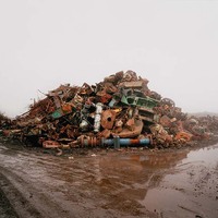
Untitled (Pile # 3)
“Crude Landscapes is an ongoing series of large-scale photographs that depict industrial sites on the ports of Lake Ontario as well as in Alberta. Boles approaches these scenes as contemporary landscape, without judgement or agenda. His compositions consciously build upon the tradition of 19th-century landscape painting and impress us with the sublime scale of modern industry. By photographing many of his scenes at night or dawn, when natural light is dwindling or gone, Boles also calls to mind cinematic scenes: his images often trace zones of industrial activity through the artificial light that illuminates the sites. The lengthy exposures needed to make the photographs in these conditions record the movement of light over the image and evoke the experience of watching them over time.” (Melissa Bennett and Sara Knelman, Curators at the Art Gallery of Hamiton.) -
-

-
-

Model for the Pyramids
"Model for Pyramids is based on an installation piece that consisted of a pyramid of fresh oranges and the remains of a decayed pyramid of the same fruit, Parsons juxtaposed a large colour photographic image of each pile side by side. Employing natural colour, each state was photographed from above to emphasize the symmetry of the arrangement. Along the lower edge of the page, a sequence of six smaller monochromatic views of the orange pyramid illustrates the process of decay. In Model, documentation becomes a work of art in its own right in the same way as do Christo’s and Jean-Claude’s photographs and drawings of their large, public, environmental installations. This print won the McIntosh Purchase Award, Western University, organized by the Print and Drawings Council of Canada in l976." -

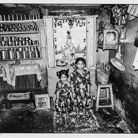
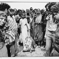
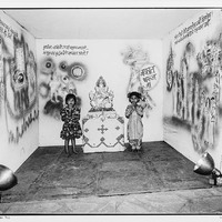
From the Calcutta Series
"Stephen Livick made six trips to India between September 1984 and November 1991. Initially what drew him to the country was the spectacle of the traditional religious celebrations. Livick centres the sculptured deities in that 1984 series within a shallow photographic space. He allows the populace, the children and other passers-by, to squeeze in between and around the religious icons, framing the edges of the images and echoing the pandals Indian artists construct to shelter their smaller statues, using curtains and painted backdrops. At the end of the monsoon season, local potters begin to sculpt various deities — Durga, Kali and Shiva, and in this photograph, Ganesh, the Hindu god of success—out of clay. The clay sculptures are paraded throughout the district towards the Hooghly River where they are allowed to float away, literally dissolving in the silt-laden current." -
-
-

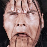
Public Displays of Affection: Elvis
Elvis is part of a series of photographs of books in milk cartons, the kind of “bookcase” one might find in a teenager’s bedroom. But these are not just any books. Primarily Harlequin romances, Cecilia Bergovic has taken a magic marker and inked out every word but ‘love’. Elvis also contains three cassette tapes by that arch-romantic heartthrob. Talk about wearing your heart on your sleeve! The shabbiness of the paperbacks, the antiquated tapes, the kitchy photos of Elvis are all to the point. A display of affection, perhaps, an obsession, definitely. This is love as crush, as all-consuming infatuation, as passing fancy, as daydream, an idea(l) of romance promoted by popular culture. (David Phillips, Seneca Polytechnic) -

-

Untitled (animated humans and animals)
“In its refusal to accept as final the limitations imposed upon freedom and happiness by the reality principle, in its refusal to forget what can be, lies the critical function of phantasy.” (Herbert Marcuse, Eros and Civilization) In the movie Take This Waltz, Seth and Margot disagree about the meaning of a drawing by Balint Zsako. She finds it disturbing; he finds it optimistic. Zsako’s drawings do this. Like Rorschachs, they elicit varying degrees of interpretation. One reads into them as much as out of them. On your first encounter you might think they’re illustrations (but for what?), perhaps cartoons (some are, after all, comic), maybe designs for outrageous tattoos (especially the silhouetted figures) or erotica (there are a surfeit of rollicking and frolicking nude males and females). On closer inspection they show traces of Surrealism, often of the menacing Magritte kind. It is Surrealism’s co-opting of phantasy that promises a way of understanding Zsako’s imagery. Herbert Marcuse has argued that insofar as they are products of the reality principle, the images of art both justify and perpetuate repressive social domination. Fortunately, the tension between reality and the promise of a better world (what Marcuse refers to as the aesthetic dimension) becomes embodied in the work of art. Art therefore reflects reality and indicts it. Art, for Marcuse, is the product of sublimation. As such, it contains the demands for gratification and pleasure which constitute the id and against which our repressive society is organized. Zsako’s images are concrete forms of instinctual libidinal and aggressive drives, memory traces, “the return of the repressed”, and the negation of unfreedom. Out of aesthetic sublimation a desumblimation takes place in the perception of individuals in respect to their feelings, judgments and thoughts accompanied by an invalidation of dominant values, needs and norms. However, any attempts, like Zsako’s, to establish imagination as a benchmark for what ought to be is passed off, by a dismissive society, as childish phantasy. We might call this reaction false consciousness. It is, in fact, the characters in Zsako’s drawings that experience the world demystified. (David Phillips, Seneca Polytechnic) -
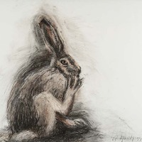
Rabbit Cleaning Foot
“As a maker of images Russell Yuristy is an illusionist, a magician of form who often looks to the fauna and flora of nature for his inspiration. Living in Ottawa, Yuristy turns to his immediate surroundings. A neighbour’s daylilies provoke a series of studies in color; tangled brush along the Ottawa river provide the occasion for endless graphic scrutiny. And the trees! Arising like giant fossils from some immemorial geological time, great fragments of tree trunks loom at the viewer, at the same time embracing and threatening. Other trees stand as mute sentinels, the living caryatids of the forest. The artist’s familiars are found here as well, for every magician must have at least one. For what else are those hares, those owls, those wolves that lurk at every corner of Yuristy’s studio? ... a talented and versatile artist, he is able to look beyond appearances and turn the seemingly banal into memorable images that remind us of our humanity and our links to an increasingly threatened natural environment.’’ -
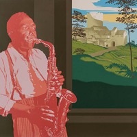
Sounds Inside
As a young amateur musician, Robert Young developed an interest in jazz which he believed to be an art form in its own right. He especially liked saxophone players, chief among these, Charlie Parker. The image of Parker is borrowed from a famous image by jazz photographer Burt Goldblatt. The ¾ portrait, reminiscent of Renaissance portraiture with its attendant connection with personal virtu, has been placed in a shallow space. A window looks out on a vista plucked from the upper left-hand corner of Titian’s enigmatic Sacred and Profane Love while the composition as a whole refers to Renaissance portraits much like Domenico Ghirlandaio’s An Old Man and a Young Man. The deliberate mysteriousness of Young’s image finds a parallel in the multi-leveled and highly symbolic meaning of Titian’s painting. What can be wrested with some certainty is Young’s love and respect for Parker expressed through equating the latter with the genius of Renaissance classical painting. (David Phillips, Seneca Polytechnic) For Renaissance painters, the flat surface of a panel or wall was a window, transparent as glass, with real objects behind it, conjured up by the miracle of multiple-point perspective. For modern abstract painters like Agnes Martin or Guido Molinari, the flat fact of the surface is as inescapable as death, something that defeats any attempt to dissolve it or make it disappear. Between these extremes of illusionism and blunt facticity lies the work of Vancouver artist Robert Young, whose inventive paintings, drawings, and mixed-media collages defy easy categorization. Though he taught for years at UBC, Young is the antithesis of an academic artist, and is now, at almost 70, in the happy position of not really having any followers. -

-
-

-

Crescent Moon
“For thousands of years, it had been nature--and its supposed creator--that had had a monopoly on awe. It had been the icecaps, the deserts, the volcanoes and the glaciers that had given us a sense of finitude and limitation and had elicited a feeling in which fear and respect coagulated into a strangely pleasing feeling of humility, a feeling which the philosophers of the eighteenth century had famously termed the sublime.” (Alain de Botton) To the Romanticists of the 19th century like Caspar David Friedrich, the moon was an element of the sublime, an agent of awe and surrender that one experienced in the face of the dwarfing immensity of the universe. Secularists all, their subject matter came to be referred to as “the cathedral of nature”. Philip Woolf’s Crescent Moon is a beacon of meaning in the midst of incomprehensible darkness made tangible through the layering of encaustic. Friedrich Nietzsche said that when we look long into the abyss, the abyss looks back into us. Woolf’s moon, however, is less existential angst, more one of promise as it moves through its monthly cycle toward full disclosure. (David Phillips, Seneca Polytechnic) "Woolf’s images of the moon, of shorelines, of the seas and of clouds, become expressions of an era of image access. What we see is transformed by the tools of technology into something altogether different. The astronomer’s lens shapes the source for these images of the moon, every bit as much as the human eye affects the way we perceive the world around us. Scales are jumped, and the surfaces we encounter are worn, textured, and evidence the process whereby nature’s elements work on all materials. Phillip Woolf’s working the surfaces of his paintings mirrors nature’s own cyclical processes. In this case, it is the artist who works the painterly surface, hand buffing them until he is satisfied with the effects of depth, of light and dark. Interestingly, because these paintings are in black and white, they reference an era when photography influenced painting. Painters in the mid-nineteenth century would make their paintings resemble the effects of cropping, of textures and subjects they found in early photography. Phillip Woolf does the same. Waxing Gibbous is as photographic as it is a textural painting. Almost intuitive, Waxing Gibbous has its borders left open, as if revealing clues to the process of painting, layering, and building textures Phillip Woolf is engaged in. Woolf’s painting recalls John Adams Whipple’s daguerreotype of the moon from 1851 for its quiet and resonant sense of the sublime. Originally referred to as photogenic drawing, William Henry Fox Talbot’s transposition of leaf patterns onto photo sensitive paper were later to have the name “light drawing” suggested by John Herschel, who had already made drawings with optical devices in South Africa. In a sense, Phillip Woolf’s Waxing Gibbous is ‘light painting’ for he is transmuting the effects of light of the moon intuitively as a painter." -
-
-
-

O Canada
We might credit the fact that O Canada is printed on cloth to Joyce Wieland’s passion for wedding art and craft. In Pop Art fashion, pressing lips greased with lipstick to the litho stone, Wieland mouthed the 68 syllables to our national anthem. She then printed an edition on paper and a smaller edition on cloth. Wieland often defied artistic conventions, incorporating many traditional women's materials and techniques, such as quilting, into her work. Through the development of her ideas and practice, she helped to force a re-evaluation of traditional women’s art and craft. Both a patriot and a promoter of art traditionally thought to be female, Wieland’s O Canada is imbued with passion, both nationalistic and sexual. Although a precursor of feminist art she herself distained the label. "Feminism is something I take for granted; I am not a theoretician." Her Toronto dealer, Av Isaacs, said of her “She was the first artist I had met whose work was done solely from a woman’s point of view. She was ahead of her time in that sense and radically important.” (David Phillips, Seneca Polytechnic) -
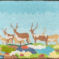
Wildlife Landscape
In 1975, Fay Loeb, in recognition that many of Canada’s commercial and public buildings were cold and stark, calculated that artist-designed tapestries would bring life as well as visual and physical warmth to these austere spaces. The cost would not be prohibitive and the tapestry would be resistant to damage. In 1976, 23 Canadian artists and sculptors were each invited to submit preliminary drawings for a tapestry in an edition of 25. Wieland’s offering came on the heels of a similar commission for the Toronto Subway: BARREN GROUND CARIBOU, a quilt work which was begun in 1975 and completed and installed in 1978 (Kendal Ave. exit, Spadina Subway Station). Imagining people from all walks of life walking past her installation, Wieland wanted to bring the caribou into the subway as a reminder of the natural world above ground. Something of the same could be said of the tapestry. Although WILDLIFE LANDSCAPE stands on its own, we might also see it as a “preparatory study” for the subway commission. (David Phillips, Seneca Polytechnic) -
Further Up the Line
Jacob Whibley is a graduate of the Ontario College of Art and Design and, until 2011, a member of the artist collective Team Macho. His art follows in the tradition of early 20th century modernism: the Bauhaus School (simplified forms and the unity of function and design) and Russian Constructivism. Admiring their texture and colour, Whibley works with pieces of vintage shipping forms and other office ephemera. Further up the Line is a play on words. The diagonal lines draw the eye upward through what otherwise are strong verticals and horizontals while the main diagonal line moves under and over the bits of paper creating the illusion of a space no thicker than a piece of paper. Shipping forms, themselves, imply the beginning of a system of transportation starting at A and ending, somewhere up the line, at Z. Or perhaps an outmoded paper technology augers space-age delivery, from computer request to delivery by drone. (David Phillips, Seneca Polytechnic) -

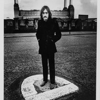
John Mayall - 1969
Wentzell was the principal photojournalist for Melody Maker from 1965-75, a period he calls a “decade long party.” He likely could have boosted his own reputation by snapping compromising shots of rock musicians as they engaged in the somewhat clichéd “sex, drugs, and rock-’n’-roll” lifestyle, but Wentzell, refreshingly, wasn’t in it for the money or the fame. Unlike many of today’s tabloid-crazed photographers seeking the most scandalous payday, he had genuine love and affection for the music and the musicians who shaped popular culture in the 60s and 70s. Many of his images have been adapted to album covers and concert posters. Poet, novelist, singer-songwriter, musician, Leonard Cohen was born in Montreal in 1934. He has been inducted into the American Rock and Roll Hall of Fame, the Canadian Songwriters Hall of Fame, and awarded the Governor General’s Award for Lifetime Achievement in addition to several other honours. (David Phillips, Seneca Polytechnic) -

Keith Emerson - 1973
Wentzell was the principal photojournalist for Melody Maker from 1965-75, a period he calls a “decade long party.” He likely could have boosted his own reputation by snapping compromising shots of rock musicians as they engaged in the somewhat clichéd “sex, drugs, and rock-’n’-roll” lifestyle, but Wentzell, refreshingly, wasn’t in it for the money or the fame. Unlike many of today’s tabloid-crazed photographers seeking the most scandalous payday, he had genuine love and affection for the music and the musicians who shaped popular culture in the 60s and 70s. Many of his images have been adapted to album covers and concert posters. Poet, novelist, singer-songwriter, musician, Leonard Cohen was born in Montreal in 1934. He has been inducted into the American Rock and Roll Hall of Fame, the Canadian Songwriters Hall of Fame, and awarded the Governor General’s Award for Lifetime Achievement in addition to several other honours. (David Phillips, Seneca Polytechnic) -

Ritchie Blackmore - 1970
Wentzell was the principal photojournalist for Melody Maker from 1965-75, a period he calls a “decade long party.” He likely could have boosted his own reputation by snapping compromising shots of rock musicians as they engaged in the somewhat clichéd “sex, drugs, and rock-’n’-roll” lifestyle, but Wentzell, refreshingly, wasn’t in it for the money or the fame. Unlike many of today’s tabloid-crazed photographers seeking the most scandalous payday, he had genuine love and affection for the music and the musicians who shaped popular culture in the 60s and 70s. Many of his images have been adapted to album covers and concert posters. Poet, novelist, singer-songwriter, musician, Leonard Cohen was born in Montreal in 1934. He has been inducted into the American Rock and Roll Hall of Fame, the Canadian Songwriters Hall of Fame, and awarded the Governor General’s Award for Lifetime Achievement in addition to several other honours. (David Phillips, Seneca Polytechnic) -
Dave Mason - 1968
Wentzell was the principal photojournalist for Melody Maker from 1965-75, a period he calls a “decade long party.” He likely could have boosted his own reputation by snapping compromising shots of rock musicians as they engaged in the somewhat clichéd “sex, drugs, and rock-’n’-roll” lifestyle, but Wentzell, refreshingly, wasn’t in it for the money or the fame. Unlike many of today’s tabloid-crazed photographers seeking the most scandalous payday, he had genuine love and affection for the music and the musicians who shaped popular culture in the 60s and 70s. Many of his images have been adapted to album covers and concert posters. Poet, novelist, singer-songwriter, musician, Leonard Cohen was born in Montreal in 1934. He has been inducted into the American Rock and Roll Hall of Fame, the Canadian Songwriters Hall of Fame, and awarded the Governor General’s Award for Lifetime Achievement in addition to several other honours. (David Phillips, Seneca Polytechnic) -

Ian Anderson - 1973
Wentzell was the principal photojournalist for Melody Maker from 1965-75, a period he calls a “decade long party.” He likely could have boosted his own reputation by snapping compromising shots of rock musicians as they engaged in the somewhat clichéd “sex, drugs, and rock-’n’-roll” lifestyle, but Wentzell, refreshingly, wasn’t in it for the money or the fame. Unlike many of today’s tabloid-crazed photographers seeking the most scandalous payday, he had genuine love and affection for the music and the musicians who shaped popular culture in the 60s and 70s. Many of his images have been adapted to album covers and concert posters. Poet, novelist, singer-songwriter, musician, Leonard Cohen was born in Montreal in 1934. He has been inducted into the American Rock and Roll Hall of Fame, the Canadian Songwriters Hall of Fame, and awarded the Governor General’s Award for Lifetime Achievement in addition to several other honours. (David Phillips, Seneca Polytechnic) -

Moody Blues - 1970
Wentzell was the principal photojournalist for Melody Maker from 1965-75, a period he calls a “decade long party.” He likely could have boosted his own reputation by snapping compromising shots of rock musicians as they engaged in the somewhat clichéd “sex, drugs, and rock-’n’-roll” lifestyle, but Wentzell, refreshingly, wasn’t in it for the money or the fame. Unlike many of today’s tabloid-crazed photographers seeking the most scandalous payday, he had genuine love and affection for the music and the musicians who shaped popular culture in the 60s and 70s. Many of his images have been adapted to album covers and concert posters. Poet, novelist, singer-songwriter, musician, Leonard Cohen was born in Montreal in 1934. He has been inducted into the American Rock and Roll Hall of Fame, the Canadian Songwriters Hall of Fame, and awarded the Governor General’s Award for Lifetime Achievement in addition to several other honours. (David Phillips, Seneca Polytechnic) -
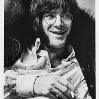
John Sebastian - 1968
Wentzell was the principal photojournalist for Melody Maker from 1965-75, a period he calls a “decade long party.” He likely could have boosted his own reputation by snapping compromising shots of rock musicians as they engaged in the somewhat clichéd “sex, drugs, and rock-’n’-roll” lifestyle, but Wentzell, refreshingly, wasn’t in it for the money or the fame. Unlike many of today’s tabloid-crazed photographers seeking the most scandalous payday, he had genuine love and affection for the music and the musicians who shaped popular culture in the 60s and 70s. Many of his images have been adapted to album covers and concert posters. Poet, novelist, singer-songwriter, musician, Leonard Cohen was born in Montreal in 1934. He has been inducted into the American Rock and Roll Hall of Fame, the Canadian Songwriters Hall of Fame, and awarded the Governor General’s Award for Lifetime Achievement in addition to several other honours. (David Phillips, Seneca Polytechnic) -

Genesis - 1972
Wentzell was the principal photojournalist for Melody Maker from 1965-75, a period he calls a “decade long party.” He likely could have boosted his own reputation by snapping compromising shots of rock musicians as they engaged in the somewhat clichéd “sex, drugs, and rock-’n’-roll” lifestyle, but Wentzell, refreshingly, wasn’t in it for the money or the fame. Unlike many of today’s tabloid-crazed photographers seeking the most scandalous payday, he had genuine love and affection for the music and the musicians who shaped popular culture in the 60s and 70s. Many of his images have been adapted to album covers and concert posters. Poet, novelist, singer-songwriter, musician, Leonard Cohen was born in Montreal in 1934. He has been inducted into the American Rock and Roll Hall of Fame, the Canadian Songwriters Hall of Fame, and awarded the Governor General’s Award for Lifetime Achievement in addition to several other honours. (David Phillips, Seneca Polytechnic) -

Leonard Cohen - 1974
Wentzell was the principal photojournalist for Melody Maker from 1965-75, a period he calls a “decade long party.” He likely could have boosted his own reputation by snapping compromising shots of rock musicians as they engaged in the somewhat clichéd “sex, drugs, and rock-’n’-roll” lifestyle, but Wentzell, refreshingly, wasn’t in it for the money or the fame. Unlike many of today’s tabloid-crazed photographers seeking the most scandalous payday, he had genuine love and affection for the music and the musicians who shaped popular culture in the 60s and 70s. Many of his images have been adapted to album covers and concert posters. Poet, novelist, singer-songwriter, musician, Leonard Cohen was born in Montreal in 1934. He has been inducted into the American Rock and Roll Hall of Fame, the Canadian Songwriters Hall of Fame, and awarded the Governor General’s Award for Lifetime Achievement in addition to several other honours. (David Phillips, Seneca Polytechnic) -

-
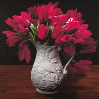
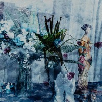
Tulipia
"The vases provide a sculptural element. But perhaps what gives her images their special glowing quality is the way Waisglass combines photography, sculpture, design theory, gardening and art history with the latest miracles of technology: enhancing the images with an array of digital tools that occupy her studio on the second floor of the house. When she started photographing her garden, her goal was simply to document the history of the property. But after dipping into the works of Victorian philosopher John Ruskin (who had an influence on the Arts and Crafts movement), she recalls, “I began to think of ways to make photos painterly.” A eureka moment came with the discovery of the idea that the quest for beauty is quickened by a sense of impending death. “If you photograph flowers, you should realize that the minute you cut the stems, you are hastening their death,” she explains. “They are at the height of their beauty. When you capture it, you know it won’t be there forever.” So before cutting those flowers, she would have her camera all set up and fresh water in the vase she had chosen. Then, for about 15 minutes, “I would shoot like crazy, taking maybe 100 pictures of each flower.” Next came the process of enhancing the images with the latest digital tricks, only recently available to artists, using digital brushes and digital paint to express her thoughts, emotions and impressions." -

Red Riding Hood
“…the young child says as she fights off sleep, ‘tell me a story about Little Red Riding Hood and the wolf.’ It’s a story about the danger of the forest, about trust, about vigilance, about learning to see the world and not the false face it puts on. It’s the type of story Carol Wainio paints.” (Jeet Heer) -

Puss and Boots Copies
“Wainio first began exploring the book as a theme in an acclaimed body of work known as Book of Hours, which focused on anonymous medieval manuscript illuminations. Since then, her interest in the history of illustration, and particularly 19th-century social caricature and Renaissance children’s stories and fairy tales, has developed into a complex consideration of the relationship between symbolic and other forms of capital, as well as the means by which social and aesthetic hierarchies are conveyed and reproduced through images. Recent work in this vein includes 2009’s Puss in Boots Copies and 2008’s Jack and the Cornstalk, which use traditional European folktales as a points of departure for a critique of contemporary injustices linked to globalization, such as the devastating social and environmental effects of genetically modified “killer seeds” and corn-derived ethanol fuel. Historically, myths and legends like Puss in Boots and Jack and the Beanstalk have functioned as cautionary tales whose morals warned against greed, duplicity and the misrepresentation of social status. Wainio’s work taps into this history, but in the service of social and aesthetic critique rather than morality. Her canvases are indeed like fairy-tale landscapes littered with the detritus of contemporary consumerism, but they are also an amalgam of modernist abstraction and the applied arts. As such her paintings question a range of stubborn class distinctions and cultural assumptions, including aesthetic hierarchies that continue to privilege painting over illustration; the paradox of value conferred by scarcity in a culture of mass production; and the conflation of democratic freedom with free-market enterprise.” (Emily Favley) -

-

Bog Series 3
The bogs of Northern Europe have, over the centuries, offered up the preserved bodies of our Iron-Age ancestors. Their scarred bodies, bound by ropes (indicative of a brutal ritualized death), has led us to believe that they were propitiatory offerings to ancient spirits. Incorporating full-scale photographic images of the mummified-like remains of selected bog specimens, Kathleen Kaufman builds her paintings by degree; from full scale-drawings, to the incorporation of textile, to textured paint and wax. Comparing the bog figure on the left with the modern figure on the right we are meant to view them not as a historical transition of primitive to modern (although it is tempting to see the fetal figure on the left and the Renaissance-like figure on the right in just these terms) or as an evolutionary argument that history is a progression from worse to better. Rather, both figures are equivalently expressive of the same inescapable life-death cycle. Perhaps to this end, Kaufman embeds a real rope in the paint that stretches from one panel to the other — “the tie that binds”. (David Phillips, Seneca Polytechnic) -
-
-
-
-

Quelque Part En Mer Entre Lisbonne et Southampton
From his very first works, Serge Tousignant demonstrated an interest in the phenomena of perception. Working in a wide range of mediums such as printmaking, painting, sculpture, installation, and photography, he explored art as a space of illusion, directing his practice toward a conceptual approach that favoured a work’s idea over its material form. His practice is characterized by the attention he brings to the specificities of pictorial space and the three-dimensional object, as well as a sustained reflection o systems of representation. -

Untitled
Fiber Artist Anna Torma on her working method: “First I imagine it – the colour, everything – and collect fibres and drawings. I do research at the library. When I feel I’m ready, I begin sketching. It doesn’t always come easily. I start filling the tracing paper with black-and-white drawings, and when I’m satisfied with that skeleton, I trace it onto the fabric. Then I sit down and begin to work. It’s a painstaking task, but I remind myself how beautiful it will be when I’m finished.” As a child growing up in Hungary, Anna Torma remembers that women in virtually every household embroidered. She went to study textile art and design at the Hungarian University of Applied Arts in Budapest in the 1970s. While most art was state (communist) controlled, such was textile art’s low status that it flew under the radar and flourished without censorship. As a mother, her artwork was adjusted to the demands of her domestic regimen. Now an empty nester, she works forty to fifty hours a week on a single piece. Torma claims that her first language of self-expression is neither Hungarian nor English but stitching. Untitled is a much less literal work then Torma’s textiles of late, pieces in debt to Art Brut and children’s art. Impressionistic, it might suggest a bed of iris, or some other such blue flower, enveloped by a fringe of grass. The aesthetic beauty in this piece is as much in the stitching and embroidery as it is in the imagery. Despite her labored planning, the immediacy of her drawing flows out in embroidered stitches. Torma’s frenetic, obsessively over-sewn surface is a sculptural/tactile accretion of matt or sheer, richly coloured threads. (David Phillips, Seneca Polytechnic) -

Heartbreaker
"If you want to know what has become of the work of Stanzie Tooth, the answer can be found in blue. In blue, you see, there is room. Room for gentle leanings toward green, or purple, or grey; room for the smallest piece of presence or a cascade of inky depth. In blue there is room for the simultaneous advancing and retreat of the colour’s own will and within it the weight of the world. In blue the sky meets the sea and there they come close enough to touch. Blue separates day from night and delineates the earth as a place to stand. In blue there is room for the firmament beneath our feet and “the mind in borrow of the body”. The works Stanzie Tooth has created for The Distance of the Moon are embodiments in and of blue. If you think when looking upon these things that this landscape painter’s feet might rest more lightly upon the earth than they once did, you would be right. Based out of Berlin since early 2016, and the beneficiary of numerous recent international residencies including the 2015 Joseph Plaskett Award, Tooth has been playing the part of a painting nomad. As a result, she has evidently thought a great deal about how paint is collected and carried. This may have begun as an issue in practicality, but practicality—like colour—is an excellent breeding ground for intention. Travel has given Stanzie Tooth’s paintings consciousness of the space within their grasp and movement has increased the span of this painter’s arms. Resolute in their blueness and the room it provides, the paintings in The Distance of the Moon are the orbit of earthly and extraterrestrial. Stanzie Tooth’s year of migration has loosened her ties to a practice of landscape painting that grounded itself in knowing and from within it she has gathered to herself the pleasure of the unknown. The Distance of the Moon is a title shared with a short story by Italo Calvino. In it, the moon and the earth are so close to one another that trips to the lunar surface are made by boat, providing that travelers can accomplish a choreographed leap from sea to sky at just the right moment. The gesture requires a certain grace and a willingness to abandon attachments in pursuit of what the moon could yield. Successful jumpers harvest the richness of the moon’s surface and enjoy an altered perspective on the earth below but are subject to the complexities inherent in leaving home. The turn in Stanzie Tooth’s new paintings exemplifies the rewards of a well-timed leap. Her works on canvas are subject to a quiet gravitational pull toward solid ground while those in plaster explore new worlds. “This should give you an idea of how the influences of Earth and Moon, practically equal, fought over the space between them,” Calvino writes.2 Stanzie Tooth is traversing the room between them. She is doing it in blue." (Jessica Bell) -

-
-
-

White Pine and The Group of Dwarfs, from the series Group of Seven and Awkward Moments
In White Pine and the Group of Dwarfs, Thorneycroft fashions a Disney-like diorama. The seven dwarfs and other Disney characters greet Snow White on a northern island sporting a white pine out of an A. J. Casson painting. Idealism of the Group of 7 meshes with cartoon romanticism. But look more closely. Snow white holds a whip in her right hand. A pair of handcuffs are partially hidden by a Hudson’s Bay blanket. A water snake parallels the blue canoe. A book by Canadian author Pierre Berton who once said that only Canadians know how to make love in a canoe, brings us closer to understanding Thorneycroft’s intention: sadomasochistic sex and the Fall from grace. We are light-years away from Disney World. (David Phillips, Seneca Polytechnic) -

-

Untitled (based on her Archives Series, 1995)
Ours is the age of trivia. We know bits and pieces of this and that while the “big picture” eludes us. We accumulate knowledge like we accumulate possessions, item by item. So to with Jeannie Thib’s art: always the part/fragment, never the whole. Drawing from a panoply of historical (some recent, some ancient) sources, she reworks her material incorporating it into/unto images of body fragments, as she puts it “to form new composites in an exploration of both the ephemerality of the body and our desire to leave a mark.” Many of Thib’s depictions of body parts are overprinted with patterns and designs—the body as social and cultural inscription. The torso in Untitled bears the imprint of what might be flocked Victorian wallpaper or an ornate floral textile design; a collision between body surrogate and nature as culturally filtered. Each image is like a museum artifact, a piece of the puzzle, a single bone of some unknown animal whose final form/meaning we can only guess at. We wear our culture like it was camouflage; we identify with it, we disappear in it, lose ourselves to it. Gary Michael Dault writes, “The exquisite precision of Thib’s work, her fight against informe (shapelessness), is the great humanist act of boundless care, her art an art of saved and saving remnants.” (David Phillips, Seneca Polytechnic) -
Icon
David Thauberger’s subject matter is closely related to the prairie landscape. As a young art student, Thauberger despaired of contemporary non-objective painting. Believing, as he did, that it’s overarching universality denied the historic specificity of place, he, like many of his fellow western Canadians including Joe Fafard and Victor Cicansky, drew on Saskatchewan folk art. “Here,” he wrote, “was a whole community of artists living around me, concerned with all of my own art concerns. Their influence on me was immediate and profound.” He intuited that not only could serious art develop in a place like Saskatchewan but could, in fact, be predicated on it. Having built a large collection of local folk art, he adopted their use of smooth flat surfaces, unmodulated colour and the incorporation of commercial elements like Mactac and glitter. Thauberger investigates how the commercial world has influenced our perception of landscape. Focusing almost exclusively on vernacular architecture and, to a lesser extent, animals, his postcard-like images, accented by Pop Art and popular culture, create a distinctive regionalist vision. As one critic has noted, you fully expect when you look at the back of a Thauberger painting or print to see the words “Wish You Were Here”. From the perspective of regionalism, Thauberger is to western Canada what Pratt and Alex Colville are to the Atlantic Provinces. (David Phillips, Seneca Polytechnic) -
-

(heart symbol)'s Katamari
“…they are always amazed by interpretations of their work because they don’t know how to interpret it themselves…. The team says outright that their work is not meant to be decoded, not intended to flummox or bamboozle their audience; they simply paint and draw, exposing what goes on inside their heads.” (A. James Bradley) -
-

-

-
-
-

-

-
-

-

-

-
-

-

-
-

-
-

-

-
-
-
-

-

Whales and Boat
“(Sleep’s) images offer a coherent life view of a kind of ‘peaceable kingdom’, a good-natured world in which the elements co-exist in a perpetual tranquility.” (Bruce Ferguson) "Originally introduced to art through colouring books given to him by nurses in the hospital, Joe Sleep gradually developed an inventory of stenciled images which could be reused to create simple and complex picture patterns. Joe Sleep would trace images from colouring books, magazines, or book illustrations per se, sometimes enlarging the size by a simple system of scaling and then he would make a hard cardboard stencil which could be used indefinitely. The inventory was revised and expanded according to customer demands and Joe Sleep’s own interest in significant images from his memory. Even his few human figures which especially look hand-drawn are stenciled images, as is the case with the greatest majority of his works. Joe was full of paradoxes. At one minute he would be the convalescent saying his painting ”helps to pass the time”; at the next, the entrepreneur promoting his product, and the next, the artist making decisions about pictorial problems. His life was full of hard work, hard times, little money, bouts with alcohol and poor health, yet his paintings were joyful representation of flowers, fish, birds, animals, boats, and buildings. Joe lived on the fringes of society, yet unknowingly contributed to the visual heritage of the province. He could be a gentle old man who loved children, or a derelict wino, obnoxious and crude. He could be childlike and dependent, or worldly-wise and philosophical. He could tell a story about how he worked with elephants on the Bill Lynch shows (could it really have been for thirty-two years?) and shortly after wonder what colour to paint an elephant’s eye because he had never seen one. In spite of, or more likely because of these contradictions and paradoxes, Joe was much more than a colourful illiterate street character. He was a friend to have a beer with, to paint a house with, and the father I never got close enough to before it was too late. There was a depth not always fathomable. He was a person with his own strengths, weaknesses, joys, fears, doubts and hopes. His painting gave him pleasure, a means of expression, and most important it gave him dignity. Well, I’m not sorry about it. I enjoyed every bit of it, and if weren’t for Ken and Harold, I’d still be down on Kent street paintin’ the shit-house door or something.” -

River of Ice, Kluane
"Soaring peaks, roaring rivers, massive glaciers, scudding clouds, wide skies dotted with snowflakes or glittering with stars—Arnold Shives makes art out of his rich experience of the mountains of British Columbia. A dedicated climber, hiker, backpacker, and camper since his youth, the senior North Shore artist has used block prints, acrylic paintings, ink drawings, monotypes, watercolours, and relief sculptures to convey the spiritual and physical grandeur of his subject. He has also communicated, through his work, his feelings of gratitude and humility in relationship to vast nature. Shives’s style ranges from a quirky and expressive form of representation, evocative of outsider art, to something that approaches biomorphic abstraction, reminiscent of Jean Arp by way of Alan Wood. In his block prints, especially his linocuts, Shives reduces landscape forms to sharply outlined passages of flat or patterned colour. His palette is understated, often monochromatic, with extensive black and white areas inflected by light and dark greys and greyish blues, creams and beiges, and sombre greens. Occasionally, as in Chalice of the Forest, a tongue of wedge of an unexpected hue, such as chrome yellow, penetrates the dominant forms. That formal arrangement—a long, penetrating form within a larger wedge or oblong—recurs in a number of Shives’s prints. Another example is Snow Gullies and Cloud, in which there is a primordial sense of life-giving energy infusing the natural world. Shives’s interests are mountaineering history, a deep Christian faith, environmental activism, and his work’s relationship to 18th-century Romanticism, 19th-century transcendentalism, and 20th-century concrete poetry." -
Darkness / Media Filter, from the series 'Exodus: The Ten Plagues'
“And therein the irony at the heart of this series lies: even though we are slowly destroying the planet and ourselves, we insist on looking fabulous while we do it.” (Bill Clarke) In the Ten Plagues series, Talia Shipman revisits the Book of Exodus. In the Shipman photographs, Aaron and Moses are represented by twenty-somethings who could be models for a Brooks Brothers ad if Brooks Brothers featured ill-fitting suits. Each of the Egyptian plagues is paired with its contemporary equivalent, e.g. frogs/overpopulation, boils/aids. Here darkness is fittingly paired with mass media, a gatekeeper feeding us inconsequentialities which blind us to the reality of our overly administered world. “Plague” connotes a calamity caused by a power outside of our control. Shipman is warning us that technology, like Frankenstein’s monster, has mutated threateningly to this very point. (David Phillips, Seneca Polytechnic) -
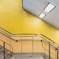
Islington (Yellow Staircase)
Who gives a second thought to the possible aesthetic qualities of subway stations? Many of Toronto’s subway stations contain works of art by prominent Canadian artists but never have these stations in and of themselves become subject to a systematic probing by an artist. Until Chris Shepherd. Shepherd patrols the urban landscape, preferably those places devoid of people. Of his fascination with the Toronto subway system, he writes, “I’ll often wait several trains just to be alone on the platform. The place changes when you remove all the people. In a selfish way, at those times I have it all to myself and my thoughts. I love the timeless nature of classic functional design, and the tiles are so beautiful. I can go on and on about the subway — it's definitely one of my favourite places.” Shepherd’s portfolio of subway portraits was taken in the very early morning when the subway was less populated, allowing us to see it with fresh eyes, illustrating how a public space is made and unmade by human traffic. Arguably Shepherd’s photographs do what photography does best—document and reveal. (David Phillips) "A continuation of his subway series that began with Transitions in 2007 and Waiting in 2010, Underground is an revival of the obsession that introduced Shepherd to the Canadian art scene. Encompassing imagery from his most recent exploration of both the Toronto and Montreal subway systems, the work is unified by the artist’s signature approach to lighting, composition and form. Submerged from view in both Montreal and Toronto, the subways of each metropolis weave, burrow, anchor and nourish the structures and urban life aboveground. Montreal’s metro is the third busiest network in North America — behind only New York and Mexico. Toronto’s subway is a close second in size to Montreal, moving fewer people but reaching more stations than it’s Francophone sister. Underground is an exploration of both city’s subterranean networks, but rather than capturing the frenetic activity of each system, Shepherd instead turns our attention to the fleeting moments between the perpetual cycle of arrivals and departures; the ignored hallways, staircases, platforms, mezzanines, tunnels and inanimate skeleton of the transit lines. Each image depicts quiet details of the everyday, resonating with a silent beauty that transforms the utilitarian spaces into painterly tableaus of contemplation. Shepherd describes his compositions as ”temporal blips in the consistent hustle and bustle of everyday life.” As part of an ongoing study, the images are inherently bound to the archives of each city, serving to document and re-document the chronological life-span of the spaces as they continually adapt to the changing needs of the urban-dweller. Underground was exhibited in Vancouver and Toronto in 2015 and is an ongoing series." -

Spadina (Deer)
Who gives a second thought to the possible aesthetic qualities of subway stations? Many of Toronto’s subway stations contain works of art by prominent Canadian artists but never have these stations in and of themselves become subject to a systematic probing by an artist. Until Chris Shepherd. Shepherd patrols the urban landscape, preferably those places devoid of people. Of his fascination with the Toronto subway system, he writes, “I’ll often wait several trains just to be alone on the platform. The place changes when you remove all the people. In a selfish way, at those times I have it all to myself and my thoughts. I love the timeless nature of classic functional design, and the tiles are so beautiful. I can go on and on about the subway — it's definitely one of my favourite places.” Shepherd’s portfolio of subway portraits was taken in the very early morning when the subway was less populated, allowing us to see it with fresh eyes, illustrating how a public space is made and unmade by human traffic. Arguably Shepherd’s photographs do what photography does best—document and reveal. (David Phillips) "A continuation of his subway series that began with Transitions in 2007 and Waiting in 2010, Underground is an revival of the obsession that introduced Shepherd to the Canadian art scene. Encompassing imagery from his most recent exploration of both the Toronto and Montreal subway systems, the work is unified by the artist’s signature approach to lighting, composition and form. Submerged from view in both Montreal and Toronto, the subways of each metropolis weave, burrow, anchor and nourish the structures and urban life aboveground. Montreal’s metro is the third busiest network in North America — behind only New York and Mexico. Toronto’s subway is a close second in size to Montreal, moving fewer people but reaching more stations than it’s Francophone sister. Underground is an exploration of both city’s subterranean networks, but rather than capturing the frenetic activity of each system, Shepherd instead turns our attention to the fleeting moments between the perpetual cycle of arrivals and departures; the ignored hallways, staircases, platforms, mezzanines, tunnels and inanimate skeleton of the transit lines. Each image depicts quiet details of the everyday, resonating with a silent beauty that transforms the utilitarian spaces into painterly tableaus of contemplation. Shepherd describes his compositions as ”temporal blips in the consistent hustle and bustle of everyday life.” As part of an ongoing study, the images are inherently bound to the archives of each city, serving to document and re-document the chronological life-span of the spaces as they continually adapt to the changing needs of the urban-dweller. Underground was exhibited in Vancouver and Toronto in 2015 and is an ongoing series." -
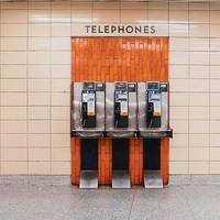
Keele (Telephones)
Who gives a second thought to the possible aesthetic qualities of subway stations? Many of Toronto’s subway stations contain works of art by prominent Canadian artists but never have these stations in and of themselves become subject to a systematic probing by an artist. Until Chris Shepherd. Shepherd patrols the urban landscape, preferably those places devoid of people. Of his fascination with the Toronto subway system, he writes, “I’ll often wait several trains just to be alone on the platform. The place changes when you remove all the people. In a selfish way, at those times I have it all to myself and my thoughts. I love the timeless nature of classic functional design, and the tiles are so beautiful. I can go on and on about the subway — it's definitely one of my favourite places.” Shepherd’s portfolio of subway portraits was taken in the very early morning when the subway was less populated, allowing us to see it with fresh eyes, illustrating how a public space is made and unmade by human traffic. Arguably Shepherd’s photographs do what photography does best—document and reveal. (David Phillips) "A continuation of his subway series that began with Transitions in 2007 and Waiting in 2010, Underground is an revival of the obsession that introduced Shepherd to the Canadian art scene. Encompassing imagery from his most recent exploration of both the Toronto and Montreal subway systems, the work is unified by the artist’s signature approach to lighting, composition and form. Submerged from view in both Montreal and Toronto, the subways of each metropolis weave, burrow, anchor and nourish the structures and urban life aboveground. Montreal’s metro is the third busiest network in North America — behind only New York and Mexico. Toronto’s subway is a close second in size to Montreal, moving fewer people but reaching more stations than it’s Francophone sister. Underground is an exploration of both city’s subterranean networks, but rather than capturing the frenetic activity of each system, Shepherd instead turns our attention to the fleeting moments between the perpetual cycle of arrivals and departures; the ignored hallways, staircases, platforms, mezzanines, tunnels and inanimate skeleton of the transit lines. Each image depicts quiet details of the everyday, resonating with a silent beauty that transforms the utilitarian spaces into painterly tableaus of contemplation. Shepherd describes his compositions as ”temporal blips in the consistent hustle and bustle of everyday life.” As part of an ongoing study, the images are inherently bound to the archives of each city, serving to document and re-document the chronological life-span of the spaces as they continually adapt to the changing needs of the urban-dweller. Underground was exhibited in Vancouver and Toronto in 2015 and is an ongoing series." -

Untitled
“Shadbolt’s monsters, beasts and bugs often crawl across a blasted landscape, survivors of some awful apocalypse.” (Scott Wilson) -

-

Portrait of a Young Woman
"Knowing that Volker Seding's new exhibition of photographs from his Architectural Series consists entirely of vertical, black and white prints of the façades of old urban buildings in no way prepares you for their impact. The fact is, this virtuoso German born, Toronto-based photographer, whose latest work is now at the Stephen Bulger Gallery, can make you feel you've never looked attentively at a building before. Part of it lies in the astonishing detailing afforded by Seding's high focus. And part of it lies in the way that detailing is delivered to the viewer by means of the photographer's truly exquisite printing. This is the kind of printing whereby the photo is somehow or other taken beyond the realms of normal vision to a point where there is now more to see in the photograph than was originally seen by the naked eye. This is probably impossible, but that's how it feels. A kind of strange surrealism haunts these brilliant photographs -- a surrealism that is close to the word's origins: sur-real, or more than real. All this is probably far from Seding's objective which, presumably, is to document these burnished, sometimes genteelly down-at-the-heels buildings -- like Toronto's Massey Hall, The Cameron House on Toronto's Queen Street West, mouldering loft buildings in New York and Havana -- with a certain loving objectivity, and with the organizing and categorizing passion of an anthropologist. The fact is, however, that gathered into the deep gaze of Seding's big camera, these venerable old buildings come on like human subjects -- unique, flawed, quirky, crumbling and yet indomitable. What presence they embody! And what stories they hold -- scarred at street level by their intercourse with the world (graffiti, signage, broken windows), and left quietly to themselves above ground (dark, silent rooms, tattered blinds, empty windows)." -
Untitled (Bunny Figure)
“Early on Scott created a human/bunny hybrid figure infused with a dualistic anxious/stoic, pathetic/hopeful demeanor representing the ordinary person. This has become somewhat of a trademark image for him. Hundreds of images of this character appear in drawings on all scales as well as in room-size installations.” (David Liss) Our society has come a long way from 1950s in which Mad Magazine proclaimed “What? me Worry?” to today’s “culture of fear”, when three out of four Americans claim that they are more disquieted today than they were twenty years ago. So many frightened bunnies. Many of John Scott’s visionary paintings and drawings deal with the ravages and ultimate destructiveness of war. Deliberately primitive and made with inexpensive materials, his paintings are materially equivalent to his apocalyptic subject matter. His warplanes, like angels of death, fly over lifeless, devastated landscapes. These images are the stuff of nightmares. His rabbit-like figures approximate to us, Scott’s anxiety prone contemporaries, fearful of such technological calamity, rampant militarism and much else. His favoured use of heavy dark lines is suggestive of a concomitant feeling of impending tragedy. (David Phillips, Seneca Polytechnic) -

-
Kim Phuc
Kim Phuc (b. 1963) was the subject of an iconic photograph taken on June 8, 1972 by Nick Ut during the Viet Nam war. She has lived in Ontario since 1992. Scherman contacted Phuc who agreed to sit for a portrait. He focused on Phuc’s skin and the permanent damage caused by the napalm attack. He used melted wax (encaustic) to represent what her skin looks and feels like today. -
Funeral
“In his last book, The Tears of Eros, George Bataille contends that eroticism is contingent on an awareness of death. Sawai’s experiences of war and disease certainly provide him with such a poignant awareness.” (Katherine Yitalo) -
Isolde and The Cow
In a series of strangely affecting silkscreen prints made in the early ’70s, Roger Savage posed single figure against single figure: woman and grass-cutter, tractor and the Halifax Citadel. Here, Savage’s wife Isolde holds her hand, palm up, for inspection by a spotted cow. Omitting mid-tones, the image flattens out in a way like that of an icon. In all these prints there is no background, no details that allow the viewer to place the image within a specific time-frame or specific location. We are left to contemplate the mysterious, unspoken relationship between human and animal. -
Ten Thousand Leaves III
John Berger observed that in art, “men act and women appear. Men look at women. Women watch themselves being looked at.” In direct contrast, Sasaki’s female child subjects interact with the viewer. The girls use props such as their fingers, glasses or plastic eyes to control both their own view out of the painting and the view of the observer on the work. Placed in dreamlike surroundings, they speak to us of their own abilities, thoughts and feeling. No longer objects, Sasaki effectively changes the traditional dynamic through the gaze of these energetic subjects. Traditionally, a woman's presence in painting has always related to itself, not the world. -
-

Sonogram
"Rubinstein draws inspiration from varied sources, including Aztec codices, Hebrew text, and ancient Equadorian pottery designs. In SONOGRAM, the central image is based on a fetal ultrasound scan suggesting amniotic fluid, nourishing and protecting new life. Surrounding the womb/sonogram are layered representations of rural Ontario's vegetation and hills. Seen from a distance, the complexity of images dissolves into abstraction. SENESCENCE and SONOGRAM are two large-scale, block-printed, painted and carved wood panels. In SENESCENCE, the framework is a repetition of the Hebrew text of Kaddish, a mourner's prayer that addresses the releasing of attachment to mortal existence. In SONOGRAM, the central image is based on a fetal sonogram, but also resembles a pond, consisting of dozens of prints of fish, babies, stones, socks, and flying women. The pond echoes amniotic fluid, nourishing and protecting new life. Surrounding the pond/sonogram are layered representations of rural Ontario's vegetation and hills. Seen from a distance, the morass of images dissolves into abstraction." -

-

Nlaka'Pamux, B.C.
"Renwick’s colour photographs of First Nations churches in British Columbia, which were on view at the Art Gallery of Ontario in 2007 at the same time as an Emily Carr retrospective, are an extension of the documentary impulse and subtle political engagement of the Totem photographs. Nlaka’pamux (2005), for instance, shows a simple log-cabin church with an elegantly peaked roof and whitewashed bell tower, set on a flat, brown landscape, the horizon line high and the sky above it radiantly blue. Secwepemc (2005), on the other hand, is an image of a narrow clapboard structure fronted by a tower; half the church is cloaked in shadow and half shines in clean sunlight. Renwick’s churches have the pristine beauty of Shaker architecture and suggest a humble, intense spirituality. The Art Gallery of Ontario owns Indian Church, one of Carr's signature pieces, which she did in 1928. Beyond signaling a shift in Carr's work to fewer First Nations themes [as proposed to her by Lawren he Art Gallery of Ontario owns Indian Church, one of Carr's signature pieces, which she did in 1928. Beyond signaling a shift in Carr's work to fewer First Nations themes [as proposed to her by Lawren Harris], Indian Church also signals the times in which churches were used as instruments to assimilate natives and encourage them to abandon their culture. A few years ago, Arthur Renwick started travelling the West, where he's from, to photograph churches in native communities. Many of these churches were built in the late 19th century and were around when Carr was living. While churches still stand in native communities, a lot of things have changed. Now members of First Nations are becoming ministers. First Nations people are erecting totem poles in or near the churches. So, they're taking authority of these institutions. The churches are still central, but the nature of assimilation has changed. The assimilation in the late 19th century was a one-way street. But now it's happening in the opposite direction; assimilation is a two-way street. So, you look at these two works, Carr's Indian Church and Renwick's photographs, and you realize in that span of almost 100 years a huge shift has happened. Between Renwick and Carr, we begin to see the First Nations of today next to the First Nations of yesterday. Toronto-based First Nations photographer Arthur Renwick frequently returns to his ancestral home in British Columbia. On a trip home in the summer of 2005, he photographed several churches within First Nations communities, struck by their simple, tranquil beauty and stark white stance. These churches, having survived since the late 19th century, can be viewed as symbolic of the cultural assimilation programs imposed by the government of that period. They have since become quiet witnesses to First Nations authority. During the first half of the 20th century, Christianity filled the void created as a result of the government's outlawing of First Nations spiritual and cultural practices. Many First Nations people continue to embrace Christianity but have established their own traditional practices, such as the raising of totem poles, into the rituals of the church. Some have exerted their influence by becoming ministers. Others have adapted old traditions to new pursuits, for instance, using their woodworking skills to build churches. The presentation of Renwick's photographs in the context of the Emily Carr exhibition in intended to make connections with her painting, Indian Church, 1929. Both artists address relevant issues to the cultures of the Northwest coast. While Carr documented a dying civilization, Renwick reveals the continuing integration of Christianity into contemporary First Nations culture. Unlike Carr's church set forlornly in a dense forest Renwick's buildings are located squarely in the community, where we see snippets of community life happening around them." -
Mask Series: Carla
“…this history (the representation of First Nations people) includes a pseudo-anthropological quest to document ‘vanishing’ cultures, in which artists often staged their images to make their subjects look ‘more authentic’ to the romanticized European concept of the Indian. Renwick’s Mask series intervenes in this history of misrepresentation by allowing First Nations artists and curators (Renwick’s subjects) to stare back through the lens and respond to it.” (Lynn Beavis) -
Mask Series: Michael
“…this history (the representation of First Nations people) includes a pseudo-anthropological quest to document ‘vanishing’ cultures, in which artists often staged their images to make their subjects look ‘more authentic’ to the romanticized European concept of the Indian. Renwick’s Mask series intervenes in this history of misrepresentation by allowing First Nations artists and curators (Renwick’s subjects) to stare back through the lens and respond to it.” (Lynn Beavis) -
Mask Series: Rebecca
“…this history (the representation of First Nations people) includes a pseudo-anthropological quest to document ‘vanishing’ cultures, in which artists often staged their images to make their subjects look ‘more authentic’ to the romanticized European concept of the Indian. Renwick’s Mask series intervenes in this history of misrepresentation by allowing First Nations artists and curators (Renwick’s subjects) to stare back through the lens and respond to it.” (Lynn Beavis) -
-
-

-

Our Home
This artwork was unveiled at the Newnham campus on April 8, 2011 by Seneca President David Agnew and Gary Lipinski, President of Métis Nation of Ontario. The original painting, commissioned by First Peoples@Seneca, combines traditional Indigenous imagery together with a representation of Seneca’s Newnham campus. A self-taught artist, Jay Bell Redbird is a member of the Wikwemikong Unceded Reserve, and exhibits his work regularly in Toronto and regional galleries. -
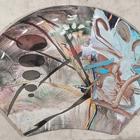
Laying in the Satin Field (Magnetawan)
One can imagine that Laying in the Satin Fields (Magnetawan) was first sketched with Rayner on his back looking up at the summer sky and capturing a spectacle in transition, the dome of the sky reflected in the upper arc of his fan shaped canvas; dark clouds, white clouds, clouds expanding and shrinking, the light constantly modulating and, overall, the sound of the turbulent river. Not the muted capturing of a single, frozen moment as in an Impressionist painting, but synaesthesia, the integrated dynamic image of sound, smell and sight experienced through a series of moments in time, a memory felt significant enough to be enshrine in acrylic paint. (David Phillips, Seneca Polytechnic) -

Untitled (Drumsticks)
This print comes from a series created by nine Canadian artists who were associated with a group called The Artists' Jazz Band which was active in Toronto from 1962 to around 1985. The prints were put out by the Isaacs Gallery in Toronto in 1974, and originally came in a wood and masonite box with two phonograph recordings. The objective was 100 complete sets; we believe fewer than 50 were completed. The prints all relate to the theme of jazz. The Artists' Jazz Band itself was a pioneering Canadian free-jazz group initially composed of Toronto visual artists associated with the abstract-expressionist movement of the late 1950s. Collectively self-taught, it was formed in 1962 in a studio over the First Floor [jazz] Club by Dennis Burton, who played saxophone, and Richard Gorman, who played bass - both were members only briefly - with Graham Coughtry (trombone), Nobuo Kubota, (saxophones), Robert Markle (tenor saxophone and piano), and Gordon Rayner (drums). It included on a casual basis many other artists and musicians, including Bill Smith, Michael Snow, the bassist Jim Jones, and the guitarist Gerald McAdam. (David Phillips, Seneca Polytechnic) -

Wringing Shirt (from the Domestic Object series)
The hallmark of 70's art was macho-like male driven Neo-Expressionism, what art historian Joan Murray tagged "penis-as-paintbrush art”. Unless they were dead, female artists were, for the most part, excluded from mainstream galleries. Against all odds, artists like Mary Rawlyk were left to cut out a role for themselves, a role that often militated against flavour-of-the-day isms, a role defined by feminist ideas. According to Rawlyk, Wringing Shirt is a metaphor for the etching process: the old-fashioned wringer and the etching press are similarly constructed while the shirt plate is made and printed in the same way that the shirt is wrung through a wringer. Rawlyk writes, “I have no pretense about an artist’s glamorous existence — I just keep making prints, cook three meals a day for my family, bake cookies for the church bazaar and send the children off to school.” After Rawlyk has spent so many years virtually confined to her home, it is little wonder that her subject matter, like that of Mary Pratt, comes from her domestic environment. (David Phillips, Seneca Polytechnic) -
-

Cats and Bus
Principally a video artist, Geoffrey Pugen is, nevertheless, adept at digitally manipulating photographs. The result is an image that contains incongruous juxtapositions between, in this case, cats and school bus. As critic Derek Flack explains: “The interrogations that Pugen's work provides are more theoretical and philosophical, asking us to question what we take as real, and the degree to which we can trust the images that saturate our culture. In essence, digitally manipulated images make explicit what has always been implicit regarding the photograph's relationship to truth: to some degree or another, they depict what the photographer wants us to see.” (David Phillips, Seneca Polytechnic) -

Aeroplane
Aeroplane is one of the most important graphic works to come of Cape Dorset. Shortly Canada Post announced that it was to be issued as a 14-cent stamp (1978), we received a number of inquiries from collectors of Inuit art anxious to purchase the print from Seneca Polytechnic. The year 1957 marked Pudlo Pudlat’s first direct encounter with an airplane. Following a hunting accident, he was flown to and from a southern hospital. Subsequently, Aeroplane was among the first Inuit prints to incorporate western imagery, linking modern technology with Inuit culture and traditional values with Western encroachment. It may also illustrate how Christian teaching, in this case the ascension of Christ, has been filtered through traditional Inuit understanding and sensibility. Pudlo was the first Inuit to be honoured with a solo exhibition at the National Gallery of Canada (1993). (David Phillips, Seneca Polytechnic) -

Untitled
Terry Ryan took up full-time residence as the Dorset Co-operative’s art adviser in 1960. The first catalogued collection of Cape Dorset prints was made in 1959 and exhibited in the spring of 1960 at the Montreal Museum of Fine Arts. Some of the early prints were based on small drawings and sketches made by the printmakers. The early drawings, such as the one seen here, show an impressive range of styles and individual solutions to working on a two-dimensional surface. Initially, more than 100 people tried their hand at drawing. (Jean Blodgett, In Cape Dorset We Do It This Way, McMichael Gallery, 1991) -

It's Only Rock and Roll: Now They're Planning the Crime of the Century So What Will it Be?
"Michèle Provost’s It’s Only Rock and Roll, was part of an installation of 44 framed embroideries featuring lyrics from pop songs examining how we find personal significance in even the most clichéd cultural references. Accompanied by an audio play list of the artist’s own “Top 40” pop songs, It’s only Rock and Roll combines recognizable lyrics from famous bands like The Rolling Stones and The Doors alongside songs by lesser-known groups such as the Boomtown Rats and Pulp. Provost’s selection of songs, along with the painstaking way each piece has been individualized with careful combinations of colours, patterns and fonts, give us insight into the cultural milieu that has informed her current practice as an artist. But even more revealing are her unintentional misinterpretations of lyrics–such as turning Bran Van 3000’s “Mamma don’t smoke that much dope” into “Mom, I don’t smoke that much dope”–which highlight the ways we often misunderstand mass media’s intended messages to make meaning of our own." -

L'Immaculate
For Antoine Prévost, as it is for many Quebec writers and poets, solitude is a central theme. Prévost’s figures wander at large through a snowy, solitary, vaguely surreal landscape. His draped figures are anonymous prototypes rather than specific portraits. Solid enough in their materiality, they, nevertheless, inhabit a dream-like world. This world creation of Prevost’s refers to the historic Québecois past, to a past in which he was steeped growing up, but a past that Prévost realized in retrospect to be a distorted reality, a fiction, a dream. By 1980, Prévost was living in a house connected in the 1880s with members of his own family. Discovering portraits of the original owners, Cyrice Tétu and Juilie Caroline Dionne, he created a series of works based on the events of their lives: born into poverty, rising to affluence and dying as paupers. L’Immaculate is part of that series. (David Phillips, Seneca Polytechnic) -
Tied Boat
Tied Boat was originally designed to be a simple lithographic print, but Mary Pratt was not satisfied with the colouration and decided to recolour each of sixty prints by hand. When the image was purchased from the Aggregation Gallery, about two dozen prints were spread on the floor to choose from. Each differed in terms of saturation, brightness and intensity — from very subtle to very bold. No two were the same. This is not surprising when we understand Pratt’s propensity for organizing the surface of things and for bathing her subjects in atmosphere. What makes Tied Boat so interesting is that instead of letting nature light her subject (Pratt’s usual modus operandi), here she becomes the arbiter. As in so many of her paintings, Pratt zeroes in on her ordinary, unexceptional subject matter. The resulting exclusion of peripheral non-essentials allows us to concentrate on the objects otherwise unobserved complexity. Chance encounters with the essentials and inessentials of her household are often turned into paintings. She writes: "Seeing the groceries come in for instance. Or cooking. I'm getting supper, and suddenly I look at the cod fillet spread out on the tinfoil and I think, 'That's gorgeous, that's absolutely beautiful' ". Those same objects--fish, eggs, cake, fruit, jelly--are often depicted in simple containers--bowls, cartons, plates, tinfoil--as if they were offerings. Tied Boat too, like a pair of cupped hands, offers itself up for aesthetic edification. Unlike her husband’s transcendent New Boat, Mary’s boat is in the moment. (David Phillips, Seneca Polytechnic) -

Wall Facing West
9/10 clapboard and 1/10 sea, the sense of repose in WALL FACING WEST is in part achieved by a perfect balance of horizontal and vertical, shallow and open space. Anyone who has spent time in Newfoundland can testify to Pratt’s ability to capture the light and mystique unique to that Canadian province. (David Phillips, Seneca Polytechnic) -
Victoria Regina
This single-colour serigraph is based on a 6-cent Newfoundland stamp released at intervals between 1868 and 1875 featuring a portrait of Queen Victoria. Portraits of Queen Victoria appeared on hundreds of different stamps issued across the Commonwealth throughout her sixty-four-year reign. The stamp design that Pratt references in this serigraph features a portrait of Queen Victoria dressed in "widow's weeds". This was at the Queen's own insistence - her husband Albert had died of typhoid fever in 1861, and she wore mourning clothes every day thereafter until her own death forty years later in 1901. Until it became the tenth province to enter the Canadian Confederation on March 31, 1949, Newfoundland issued its own postage stamps. (David Phillips, Seneca Polytechnic) -
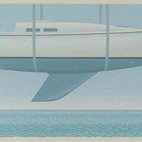
New Boat
Clean and shiny like a newborn baby (male, if one takes into consideration that the boat is blue), New Boat represents new beginnings. If we acknowledge that water may symbolize death, then we have here the complete life cycle with its infinite possibilities as denoted by the seascape. Boats figure significantly in the work of Christopher Pratt, an avid sailor. Boats are, of course, associated with the Atlantic seaboard where Pratt makes his home. However, one would be mistaken to take New Boat as either anecdotal or a reference to a particular boat Pratt might own. His boat transcends the particular. It is a universal. It is Boat or boatness in the sense of Plato’s ideal forms: mystical, timeless and devoid of contingency. (David Phillips, Seneca Polytechnic) -
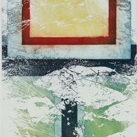
-
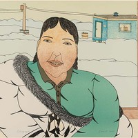
A Friend Visits
Pootoogook’s drawings challenge conventional expectations of ‘Inuit’ graphic art. An instinctive chronicler of her generation, Pootoogook creates drawings that are peppered with images of daily life: ATM cash machines and current events on television, Playboy-style eroticism, alcoholism and spousal abuse. Her immediate success drew the attention of art collectors at the same time as it signaled to her graphic artist colleagues in the North that there were no limits on subject matter and scale. -

-

-

Psychic Bird
"I first exhibited the photography of my dear friend Mary Pocock in 1998 with River Dialogue, a simple slideshow to celebrate her art, and the message of her beautiful life. By then, Mary was nearing the end of her anticipated days. The outlook was bleak, but happily, she thrived well enough to help me follow up with River Dialogue: Earth. By 2002 Mary had already outlived every professional prognosis by nearly a decade, and The Pocock Diaries was born. I personally never imagined that ten more installments would come along, and that her blog could continue for another two years. Mary's art conveys unexpected truths about the meaning of existence, about beating all of the odds and about dying with dignity. Her approach was simple catharsis; an elegant achievement that so many women, across Canada and around the globe took much from. It has been six years since she left us but I personally believe she's still here and very much a timeless feature, so I have no immediate plans to archive this inspired piece." -

Untitled (Draft for a Poster)
This drawing was a draft for a poster for an exhibition at Winnipeg Art Gallery 1976. -

Young Bears
Pitseolak Ashoona was among the first generation of Cape Dorset artists. Encouraged by James Houston “to draw the old ways”, Pitseolak was self-taught and, like her contemporaries, developed a style uniquely her own. Young Bears exemplifies characteristics typical of so many early Dorset prints: lack of a figure/ground relationship; multi-perspective — each of the three groups of bears is seen, simultaneously, from a slightly different perspective. And if this image, in its apparent simplicity, recalls the drawings of young children, it is for very good reason. Before we learn to write, anthropologist Edmund Carpenter argues, we inhabit “acoustic space”, a codification of reality also associated with hunting and gathering (preliterate) societies. He elaborates that, in opposition to visual space (space created by the eye): “Auditory space (space created by the ear) has no point of favoured focus. It's a sphere without fixed boundaries, space made by the thing itself, not space containing the thing. It is not pictorial space, boxed in, but dynamic, always in flux, creating its own dimensions moment by moment. It has no fixed boundaries; it is indifferent to background.” This is Pitseolak’s world. This is what informs her art. (David Phillips, Seneca Polytechnic) -
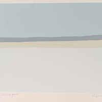
-

Totems, Alert Bay, B.C.
Angus MacDonald was a noted stained-glass artist. Among his commissions were several Toronto churches, the C.N.E. and the King Edward Hotel. We knew him as a colleague who taught ceramics. Angus owned an art gallery on Yonge St. in the 1930s. One of the artists he represented was W. J. Phillips. When Phillips received a commission from Canadian Pacific Railway to fill their hotels with his work, he wrote Angus asking that he send him everything he had on hand. Several years later, MacDonald received two packages in the mail containing dozens of Phillips’s prints, a gift from the artist in thanks for any inconvenience he had caused Angus. Some thirty years later Angus was encouraged to open the dusty parcels that had not seen the light of day in all that time. From the large volume of pristine woodcuts, the Seneca Gallery mounted a small print retrospective. From that exhibition the college purchased Totems. (David Phillips, Seneca Polytechnic) -

Totem, B.C.
"Angus MacDonald was a noted stained-glass artist. Among his commissions were several Toronto churches, the C.N.E. and the King Edward Hotel. We knew him as a colleague who taught ceramics. Angus owned an art gallery on Yonge St. in the 1930s. One of the artists he represented was W. J. Phillips. When Phillips received a commission from Canadian Pacific Railway to fill their hotels with his work, he wrote Angus asking that he send him everything he had on hand. Several years later, MacDonald received two packages in the mail containing dozens of Phillips’s prints, a gift from the artist in thanks for any inconvenience he had caused Angus. Some thirty years later Angus was encouraged to open the dusty parcels that had not seen the light of day in all that time. From the large volume of pristine woodcuts, the Seneca Gallery mounted a small print retrospective. From that exhibition the college purchased Totem." (David Phillips, Seneca Polytechnic) -
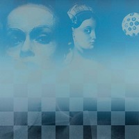
-
-

-
-

Untitled (Hunters and Dogs)
"In many of his drawings, Parr laid in solid areas of colour with his felt tip pen and then applied a small amount of water, creating an effect like a watercolour wash. This treatment lends variety and three-dimensional substance to the forms. The drawn lines Parr used in his images were “strong” with humans and animals shown with minimal detail with only their “essential features” drawn. His style has drawn comparisons to “prehistoric Dorset art or pictographs. Unlike other Inuit artists of his community Parr rarely drew his images from legends or from shamanic lore. Parr, instead, favoured depictions of the hunt, based on his early life, which included both hunters and animals. Christine Lalonde observed that Parr’s early work was “remarkable for their lack of hesitation and directness of thought and expression.” Parr signed this drawing with his characteristic lower case “c” found lower right. (Jean Blodgett, In Cape Dorse We Do It This Way: McMichael, 1991, page 63.) -

-
-

-

-
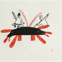
Whales
A strong, bold graphic sense informs all of Oonark’s work. Traditional dress, women’s facial tattoos, and shamanistic themes are common in her art, yet they usually appear as isolated, fragmentary forms, shaped into a graphically bold image rather than a comprehensible narrative. Oonark is also well known as a textile artist, whose wool and felt wall-hangings reveal her as a master of color and form. (Janet Catherine Berlo in “North American Women Artists of the Twentieth Century: A Biographical Dictionary”, 1995) -

Headland
An amateur pilot, Toni Onley flew his Buccaneer Amphibian up and down the coast of Northern British Columbia and all over the Canadian arctic allowing him access to places that might otherwise be inaccessible. He produced on-the-spot watercolours some of which were later turned into prints. His subject matter is an ancient landscape worn down to the essentials. Whereas the 18th and 19th century explorers who travelled the arctic found it forbidding, Onley’s North is becalming. As in Headlands, it excludes human presence, even that of the artist. It is as if we are observing the unobserved. (David Phillips, Seneca Polytechnic) -
Olympic Splash
To celebrate the Montreal Olympic Games, 1976, the Ministry of Culture and Recreation and Wintario sponsored a program entitled “Cultural Olympics”. As its project, the Faculty of Fine Arts at York University held a Graphics Workshop from 25 May to 25 June 1976, in which five artists each realized an edition of 30 prints in homage to the Games. (David Phillips, Seneca Polytechnic) -
Untitled (Rugby)
To celebrate the Montreal Olympic Games, 1976, the Ministry of Culture and Recreation and Wintario sponsored a program entitled “Cultural Olympics”. As its project, the Faculty of Fine Arts at York University held a Graphics Workshop from 25 May to 25 June 1976, in which five artists each realized an edition of 30 prints in homage to the Games. (David Phillips, Seneca Polytechnic) -
Olympic Print
To celebrate the Montreal Olympic Games, 1976, the Ministry of Culture and Recreation and Wintario sponsored a program entitled “Cultural Olympics”. As its project, the Faculty of Fine Arts at York University held a Graphics Workshop from 25 May to 25 June 1976, in which five artists each realized an edition of 30 prints in homage to the Games. (David Phillips, Seneca Polytechnic) -
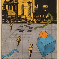
A Many Spendor Thing
To celebrate the Montreal Olympic Games, 1976, the Ministry of Culture and Recreation and Wintario sponsored a program entitled “Cultural Olympics”. As its project, the Faculty of Fine Arts at York University held a Graphics Workshop from 25 May to 25 June 1976, in which five artists each realized an edition of 30 prints in homage to the Games. (David Phillips, Seneca Polytechnic) -

Great Olympic Thrust
To celebrate the Montreal Olympic Games, 1976, the Ministry of Culture and Recreation and Wintario sponsored a program entitled “Cultural Olympics”. As its project, the Faculty of Fine Arts at York University held a Graphics Workshop from 25 May to 25 June 1976, in which five artists each realized an edition of 30 prints in homage to the Games. (David Phillips, Seneca Polytechnic) -

-
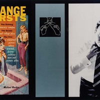
Strange Thirsts
"I had seen lesbian pulp fiction covers on more than one occasion beforehand and thought the addition of the graphic instruction in necktie folding along with the blurred photo of a butch lesbian to be making too literal a point about cultural representation and the fluidity of gender. They do not surprise me or show me something I have not seen before, but I am also aware that this is because I fully embrace the fact that gender is a construct. In a manner so typically Canadian, I find the most fault in that which most closely resembles me, thus my surprise to see this work in this particular venue. I even quibble about giving this entry the tag “lesbian art” still aware of potential ghettoization with the use of this term, but I think Newdick’s (I laugh every time that I write this name) work should be seen by those looking for lesbian art (and others of course). It’s just the way that Newdick intended it. As the gallery notes for the original showing of “Heroine” reads: Newdick “explores the problematic of women’s identity and the bigotry against lesbians and all women who go against the dominant model.” (Rhonda Olson) -

-
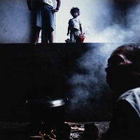
Seeking Refuge (Iran, 2015)
"Dominic Nahr works with a strong and unwavering gaze, aiming to document and disseminate images of actions that must not be continued or forgotten. He is intent on reporting certain and unflinching narratives about natural catastrophes, civil unrest and crimes inflicted in the pursuit of protecting physical and psychological borders. Nahr was raised in Hong Kong where he established himself as a photojournalist with South China Morning Post. He relocated to Toronto and subsequently graduated from Ryerson University in 2008. Nahr has been honoured with several prestigious awards, including The Oskar Barnack Newcomer Award. He has been selected as one of the ‘Top 30 under 30 photographers’ by PDN magazine and has been exhibited at Visa Pour l’Image in Perpignan, France. Nahr was selected to take part in 2010’s Joop Swart Masterclass in Holland and received grants from the Pulitzer Center and the Emergency Fund. Dominic Nahr joined Magnum Photos as a nominee in July 2010. Nahr currently resides in Nairobi, Kenya." -
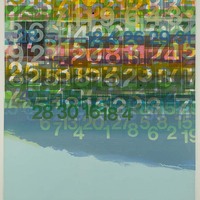
-

-
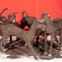
-

Sunset Ceremony
In the early seventies, Norval Morrisseau often combined Ojibwa mythology or Ojibwa images and symbols with Christianity. Morrisseau’s early instruction was in the Catholic faith. His personal culture was a hybrid of western and native. As his biographer Jack Pollock points out, his art is, consequently, one of personal expression rather than a cultural mirror. During the period of the sunset ceremony, native participants abstained from food and drink, painting their bodies in symbolic colours. Facing the sun, they danced on their toes, lacerating their arms and thighs with gashes or suspended themselves from a central pole by ropes and hooks through their skin. They continued dancing until they either fell unconscious or tore themselves loose, whereupon they would experience visions. When viewed from a European perspective, the painting begs comparison to the crucifixion of Christ. Sunset Ceremony is thus an amalgam of mythology and Christianity. (David Phillips, Seneca Polytechnic) -
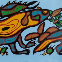
Otter and Other Life Forms
“While visiting Norval at his home in Beardmore, Ontario in 1978, he playfully told me that he had painted this split-image of the otter as a spoof to the art critics of the era who were trying to intellectually define Aboriginal art”. (Michal Liggett, May 2010) -

The Great Copper Thunder Bird
Copper Thunderbird ᐅᓵᐚᐱᐦᑯᐱᓀᐦᓯ is painted with reds, yellows, blues, purples and greens. The image of the bird seems linked to the sky and the earth. Christian Morrisseau seems to be tying the natural world, the spiritual world, and the (Ozaawaabiko-binesi) is the Indigenous name of Norval Morrisseau, Christian Morrisseau’s father. According to Anishinaabe tradition, the thunderbird is a very powerful spirit being. The imagery is painted in the Woodlands style with X-ray images and bright colours. The bird’s head is black, but its feathers and body are painted with reds, yellows, blues, purples and greens. The bird is large in the picture and seems linked to the sky and the earth. Christian Morrisseau seems to be tying the natural world, the spiritual world, and the heritage of his father together in one image. -

Blue Words
“Moodie’s works, at a distance, appear ‘total’, an abstract whorl of patterned lines. At 15 feet, they appear to be enlarged details of thumbprints, a distant knot of calligraphy, with neither subject nor content. Come a little closer and their details are still not specific; they might be decorative kufic, the patterns created by Arabic script from the Koran meant to be both legible as text but also a decorative, iconoclastic gesture. But the moment you come within the gravitational pull of Moodie’s world, you are drawn into an impossibly and obsessively composed drawing that is mad with a multitude of simultaneous events.” (Russell Kiziere) -

L'homme Volant (The Flying Man)
After he read a book by Carl Jung on the subject of archetypes and symbols, he studied the language of forms that repeat and reflect; his direction became psycho-pedagogic. Montpetit worked many years in education, his work led him to create images suggestive of children's' games. Montpetit's painted colourful shapes that vibrated, pushed, pulled, and tugged in a fantasy of toys coming to life. In the late 70s up to the late 90s, Montpetit moved on to curved shapes that twist, turn and form knots. -
Painting Place (Hilltop)
Printed in an edition of 3000 for Colophon Journal. There were 8 states of which this print is from the 3rd. It was the only state that was signed by Milne in the bottom left. This print includes a copy of the Colophon Quarterly, 1931, Part 5. (David Phillips, Seneca Polytechnic) -

-
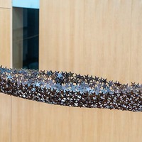
Star Canoe
“As a subject, or a point of departure, the canoe and canoeing cut across regional, generational, media-related, and stylistic boundaries in the complex fabric of contemporary Canadian art, allowing an enriching examination and enjoyment of a group of otherwise unrelated artists.” (Liz Wylie) Deserving of iconic stature, canoes have made a regular appearance in Canadian art from at least 1754 (Votive of the Shipwreck at Lévis) up to, and through, Tom Thomson, Alex Colville, David Thauberger and Charles Pachter. Quebec folklore has it that Baptiste Durand’s canoe, with the help of devilry, floated through the evening sky. John McEwen’s canoe, by contrast, remains permanently suspended like stars in the firmament--the Canoe constellation — and a fitting complement to McEwen’s Searchlight Starlight Spotlight installed in front of Toronto’s Air Canada Centre. Constructed of perforated steel, this is not a canoe of the water but, like Durand’s “ghost ship,” one of the air. (David Phillips, Seneca Polytechnic) -

-

-
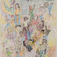
-
-
-

-

-

Radiant Birds
"Qinnuayuak was one of the first people to begin creating graphic works through the Kinngait Studios. Her early works were stonecut, in keeping with contemporary printmaking techniques at the time. Towards the end of her artistic practice in the late 1970s Qinnuayuak was introduced to acrylic paints and began creating mixed media works [4]. Her method of painting was to use broad, fluid strokes to create backgrounds and figure outlines, adding details with felt tipped pen and coloured pencil overtop [5]. The print Bird Fantasy (1977-78), composed with felt pen, crayon and acrylic, is an example of Qinnuayuak’s approach to combining mediums [6]. Lithographs of her drawings also appeared around the same time that Qinnuayuak began using acrylics. Her drawing Opiit (Group of Owls) (1976) was one of the first lithographs included in the Cape Dorset Annual Print Collection [7]. Despite the advent of paints and lithography Qinnuayuak preferred to keep her compositions on a white background, rarely depicting landscapes. Qinnuayuak’s images are surreal, colourful and frequently light-hearted in tone. She often illustrated lively compositions of families, traditional camp activities and community gatherings. Her most recognizable works are her depictions of birds. Owls were a common motif. Her earlier birds are identifiable as gulls, owls and geese, defined by bold outlines and formalized bodies. Over time the shapes of her birds became amorphous and surreal, their bodies dense with colourful patterns, as in her print Owls of Baffin (1982). Qinnuayuak’s works have been widely exhibited and were featured in nearly every Cape Dorset Annual Print Collection from 1961 to 1982. She was one of ten artists to have her design selected for the banner of the 1976 Montreal Summer Olympics, which was displayed at the Art Gallery of Ontario in Toronto, ON [8]. In 1984 the stonecut of her print Large Bear (1961) was donated to the Tate Gallery in London, UK and was later put on display at the Scott Polar Research Institute in Cambridge, UK [9]. Her work Untitled Drawing (Owl and People) (1975) was featured on the cover of the Summer 2004 issue of the Inuit Art Quarterly [10]. Most recently, a stonecut of her print Spectator Birds (1970) was featured in the exhibition Maanngat (From Here) (Nov 2016-Feb 2017) at the Drake Hotel in Toronto, ON [11]. Her works are held in numerous major artistic institutions, including the National Gallery of Canada in Ottawa, ON and the Winnipeg Art Gallery in Winnipeg, MB." -
-

Duet
“…Duet, two aluminum forms with a microscopically corrugated surface that nicely holds the light within manageable intensities. Basically, two vertical principles interrupted by a diagonal in each case. Duet achieves a dynamic and monumental effect with a minimum of effort.” (Dore Ashton) “He (Lorcini) has deliberately limited himself to exploring the permutations and combinations of angles and planes—their joining together and power of the spaces between them. Consequently, his work at first appears to be simple. You can take it all in visually immediately—so it would seem.” (Paddy O’Brien) The highly polished Duet catches, reflects or holds myriad light patterns with its varied surfaces. As in the main body of his work from the 70s, Lorcini explores the connection between music and sculpture. The variation in finish, the fugue-like connection between the two towers and the use of light to suggest immateriality create a symbiotic relationship between the two units making the sculpture a perfectly pitched tuning fork. If Duet intimates something much grander, it is for good reason. It was the maquette for a monumental-sized Montreal commission. (David Phillips, Seneca Polytechnic) -
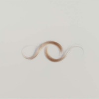
-

Study for Bedded
"Bedded is a series of open-ended dialogues about the acceptance and rejection of touch. Physical contact can depict the complexity of a relationship more accurately than words. Awkwardness or discomfort shown during moments of physical communication can suggest hidden emotions and issues within relationships. In Bedded, the viewer enters an intimate tableaux where depictions of gesture create a narrative of longing, desire, uncertainty and sadness. The models appear relaxed and seemingly unaware of the camera, absorbed in the privacy of the moment. The occasional contact between the subject and photographer alludes to the constructed nature of the images. The bedroom, which sets the scene for this work, immediately raises notions of voyeurism and invasion. Through focus and composition, the images seduce the viewer into pausing to reflect on the tactile quality of skin and hair, and the subtle movements contained within the depicted relationships. By making these images larger than life, attention is drawn to space and gesture; to those in-between moments when touch suggests something beyond the obvious. The viewer’s interpretation of these images is often reflective of their personal histories and biases, where notions of fear, anxiety, trust, and desire are all individually perceived. Through fabricated representations of intimacy a dialogue of the necessity and consequences of touch is revealed. The complex dynamics found within a relationship are not only disclosed through words, but also through gesture, touch and the spaces in between." -

Red, Yellow Fusion
“Realistic, naturalistic art had dissembled the medium, using art to conceal art; Modernism used art to call attention to art.” (Clement Greenberg) In 1962, Lochhead came under the influence of American art critic Clement Greenberg. Greenberg’s formalist conception of painting, sometimes called Post-Painterly Abstraction sometimes Colour Field Painting, muscled its way into contemporary art. Through an ongoing dialogue with Greenberg, Lochhead saw his way out of the mire of Canadian provincialism. Greenberg disapproved of subject matter and illusionism/spatiality while praising flatness and two-dimensionality and, above all, colour (elements unique to painting as a distinctive art form) even to the point of arguing that visible brush strokes were mimetic. The American painter Frank Stella summed it up: “what you see, is what you see.” Between 1962 and 1967, Lochhead painted a formidable series of colour field paintings many of which were exhibited alongside his American peers, most notably, Kenneth Noland and Jules Olitski. By 1963, Lochhead’s paintings were either sets of rectangles set loose in a larger rectangle/square or they were, like Red-Yellow Fusion, composite rectangles anchored to the lower edge of the painting by a ‘stem’. It is interesting to note that when Lochhead later returned to landscape and figurative work, he acknowledged that his formalist output was not as purely formalist as once thought. Referring specifically to the stem paintings, he acknowledged the influence of prairie flowers and other elements in the observable world which, even so, he turned into strict visual form. (David Phillips, Seneca Polytechnic) -

From the Calcutta Series
"Stephen Livick made six trips to India between September 1984 and November 1991. Initially what drew him to the country was the spectacle of the traditional religious celebrations. Livick centres the sculptured deities in that 1984 series within a shallow photographic space. He allows the populace, the children and other passers-by, to squeeze in between and around the religious icons, framing the edges of the images and echoing the pandals Indian artists construct to shelter their smaller statues, using curtains and painted backdrops. At the end of the monsoon season, local potters begin to sculpt various deities — Durga, Kali and Shiva, and in this photograph, Ganesh, the Hindu god of success—out of clay. The clay sculptures are paraded throughout the district towards the Hooghly River where they are allowed to float away, literally dissolving in the silt-laden current." -

-
A Minute of My Time
This work is part of the series 45 consecutive one-minute drawings beginning December 27, 1998 at 17:17. (David Phillips, Seneca Polytechnic) -

Study for Nurses
"Levitt was struck by the lack of racial diversity in the images. “All the women pictured on the covers of pulp novels are white, and often blonde and blue-eyed,” she said. “The school portraits are likewise predominately white. In 2011, I was commissioned to produce new work in celebration of the 100th anniversary of Women’s College Hospital in Toronto, based on research I conducted over several months in the hospital’s Archives. These photographs of the open pages of WCH student yearbooks reflect the racial and gender conformity of nursing at that time, and thus point to some of important social changes that have since taken place in the profession. When these works were first shown in the exhibition Being She: The Culture of Women’s Health and Health Care Through the Lens of Wholeness (Gladstone Hotel, Toronto) I commissioned Andrea Fatona to write an essay about the absence of women of colour from nursing to accompany my work." -

-

Asleep on the Parkway
In his most recent photographs, Lepiano looks closely at the physical borders of our urban environment. Forgotten and uninhabited spaces such as verges alongside highway traffic ramps, suburban dead zones and littered loading docks betray our complicity in transforming the urban landscape into a wasteland. Asleep on the Parkway is one such space made improbable by the inclusion of something that doesn’t belong, a man in sacrificial posture. The lusciousness of Lepiano’s photographs would seem to belie his bleak vision of urban existence. However, all civilizations appear to be built on the backs of someone or something. If the price of the success of the Roman Empire was slavery perhaps the niceties of our urban environment are purchased at the cost of an underlying blight which, along with pollution, nibbles away at our fragile existence. (David Phillips, Seneca Polytechnic) -

Temple Beggar
“In India, since there is a serious lack of electricity but a major surplus of sunlight, I use only natural daylight. To get the results I want, I am limited to only two hours in the morning... 9-11ish. This can really be a schedule nightmare in a country where yesterday and tomorrow is the same word "kal". Whether a local photo-subject will turn up on time, if at all, is always questionable... and since the Sun waits for no one, I am lucky if I complete four photo sessions a week. My house is traditionally Indian... "More Indian than my house," say all my local friends... who's homes are now, proudly filled with as much plastic and stainless steel as affordable. My home has only antiques and traditional textiles, found mostly in the "Bazaar". The bazaar is the nearby market area of tiny shops, with even smaller "head ducking" entrances, bordering either side of a maze of cobblestone lanes, which winds for kilometers... totally congested with shoppers and cows. A few choice pieces, like the glass "handis" (lanterns) and my bed are from my good friend, Sandra Long, a flamboyant antique dealer who often is a house guest while in India, on her many buying trips for her company, "Anglo Raj". Suresh, a Brahman silk merchant and one of my closest friends in Banaras, thinks that antiques, unless passed down by the family, are inauspicious... "Dead stranger's possessions!" he calls them. Furniture and most decorative objects are not really part of the average Indian's life. Historically, India existed without furniture and stitched clothing, (mostly rugs and bolsters, saris and dhotis) until the Aryan and Mogul invasions, hundreds of years ago. The Muslims are responsible for so much of what the West associates with as Indian. Most Indians live very simply, quite often on the floor, in one room which serves as kitchen, living room and bedroom. So it is not so odd really then for most of the locals to think of my home, which I feel is comfortable but rather basic like an old fort... as "very Maharaja". When I found the house, four years ago, it had not been lived in for several years... at least not by anything human. It took two months, with a working crew of at least five to make it habitable. The grain room has turned into a washroom, two toilets (one eastern, one western) replace the two holes in the ground, a kitchen with a counter and sink has materialized, hot and cold running water and electricity throughout, has been somewhat worked out. In India, plumbing and electricity are always a work in progress. All the crumbling walls have been repaired and plastered. What with its black wooden window shutters and ceiling beams it quite resembles a Spanish Mediterranean house, quite livable but far from a maharaja's palace. From the roof, depending on the season, the Ganges river can be seen in the near distance... close enough to enjoy the view but distant enough to avoid most of the devotional commotion which saturates the river "ghats" (the ancient stone steps that lead into the water.) Living in India is an ongoing game of "Hide and Seek" with the sun. From December to March, I live in the sunshine... on the roof terrace, or in the garden room, where all my finches, parrots and palm trees live. In April through June, I avoid the sun as much as possible, by spending most of the day, staying cool in the courtyard... and the night sleeping on the breezy roof under the stars. India is part of who I now am... but I am not quite sure why. Perhaps it is the mystery that draws me back, year after year. All that I perceive India to be, is just a hint of what really exists, veiled behind layers of timeless traditions and customs. Ashrams are not for me. I am attracted to India for anthropological, rather than spiritual interests... of course, one would have to be brain-dead not to be affected by India's daily religious rituals. However, I am more interested in the people and their art, music, architecture and of course, the warm winters. India is inside out and upside down... but at the root of it all, they are just human beings trying to make it in a tough world... As we all are. And they are controlled, just as we are... They, by caste and custom and ourselves, by media and technology. I wonder which is better?” (Elle Decor, December 1998) -

-

Extended Breathing with Moving Grasses
"Lake’s photographic works consist almost entirely of self-portraits, though they are not in any way documentary. They are, rather, experiments delimiting the boundaries of the body and the self from the world of society and history and, increasingly, from the natural world. As to how one begins to define one’s true self, I think the answer that falls from Lake’s work is that it neither begins nor ends but continues moment by moment, restless and blurring, to a vanishing point she has, fortunately for us, not yet reached. Her “Extended Breathing” series contains some of her most beautiful and subtle work to date. Shot in various locations at night under artificial light and displayed in lightboxes, the pieces involved extended takes of Lake attempting, and invariably failing, to stand still and simply breathe for one hour. In Extended Breathing: While Highlights Travel, 2009, for example, Lake stands in front of an old stone building, her face completely ablur, lozenges of light sweeping across the ground behind her. Extended Breathing in Dappled Light, 2009, finds Lake in a forest, hand in her pocket, face blurred, light trickling down through trees that are in perfect focus. And in the strikingly beautiful Extended Breathing: Under Porchlight, 2009, Lake stands at the edge of a wooden porch in luridly bright light, her whole body a blur; above a fence is an arc of foliage and a patch of perfect twilight blue sky. Lake’s blurred figure in these photographs is the result of the long exposures and the impossibility of remaining still for that long, and her ghosting body against all that luminous, crystalline detail creates an immediate reversal of foreground and background. “While I’m standing there for one hour,” Lake has stated, “I’m making the image in my mind’s eye, but what I’m thinking about is not predictable. Sometimes I’m in a meditative state, sometimes I’m responding to my body, sometimes to a memory.” “Extending Breathing” is a highly introspective series, her body, and time, now almost wholly subjective and in the process of disappearing. “Where do we begin to define our true selves?” Lake asks in the text from “On Stage.” Unlike portrait photography, which owes not a little of its aesthetic to the great portrait painters like Titian and Velázquez, with its striving to encapsulate an essence, the art of the photographic self-portrait is more often than not fraught, tentative, uncertain and experimental. Think, for example, of Lee Friedlander’s self-portraits as shadows on walls and urban sidewalks, or the dark, quizzical look on Diane Arbus’s face when she photographed herself pregnant and naked from the waist up, or Nan Goldin’s wounded and confused depictions of herself, or Robert Mapplethorpe’s smoldering self-portrait as a demon. Lake’s photographic works consist almost entirely of self-portraits, though they are not in any way documentary. They are, rather, experiments delimiting the boundaries of the body and the self from the world of society and history and, increasingly, from the natural world. As to how one begins to define one’s true self, I think the answer that falls from Lake’s work is that it neither begins nor ends but continues moment by moment, restless and blurring, to a vanishing point she has, fortunately for us, not yet reached." -

Pumping Water
In 1975, Fay Loeb, in recognition that many of Canada’s commercial and public buildings were cold and stark, calculated that artist-designed tapestries would bring life as well as visual and physical warmth to these austere spaces. The cost would not be prohibitive and the tapestry would be resistant to damage. In 1976, 23 Canadian artists and sculptors were each invited to submit preliminary drawings for a tapestry in an edition of 25. (David Phillips, Seneca Polytechnic) -
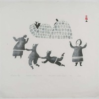
-

Untitled (Blue Square)
This print comes from a series created by nine Canadian artists who were associated with a group called The Artists' Jazz Band which was active in Toronto from 1962 to around 1985. The prints were put out by the Isaacs Gallery in Toronto in 1974, and originally came in a wood and masonite box with two phonograph recordings. The objective was 100 complete sets; we believe fewer than 50 were completed. The prints all relate to the theme of jazz. The Artists' Jazz Band itself was a pioneering Canadian free-jazz group initially composed of Toronto visual artists associated with the abstract-expressionist movement of the late 1950s. Collectively self-taught, it was formed in 1962 in a studio over the First Floor [jazz] Club by Dennis Burton, who played saxophone, and Richard Gorman, who played bass - both were members only briefly - with Graham Coughtry (trombone), Nobuo Kubota, (saxophones), Robert Markle (tenor saxophone and piano), and Gordon Rayner (drums). It included on a casual basis many other artists and musicians, including Bill Smith, Michael Snow, the bassist Jim Jones, and the guitarist Gerald McAdam. (David Phillips, Seneca Polytechnic) -
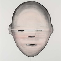
Sleeping Giant (View from the Here Series: Native Fires)
"Koop’s new suite of paintings, VIEW from HERE, both affirms and disrupts two quite different genres: landscape and portraiture. Using ink and gouache, these works use landscape tropes to compose immense and surreal human heads that seem to float in ambiguous space. Unmoored from any depiction of the body, their scale demands a paradoxical bodily encounter with the viewer, one that parallels the artist’s physical engagement with both medium and ground in creating them. Each of the eight heads recalls elements of one of Koop’s earlier landscape series, such as Satellite Cities, Native Fires, and Deep Bay, and all pose existential questions about who we are, how we are socially constructed, and what we understand about our relationship with the natural world." -

-
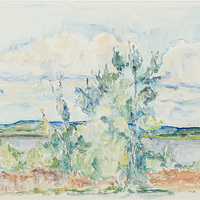
-
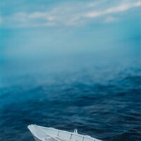
White Dory Evening
"Model ships at sea, on display and pictured in the changing weather of a maritime landscape are part of this evolving project. The premise of, “Boat,” is to tease out the allure of the model while also exploring the impulse to collect and the ability of material culture to tell stories." -
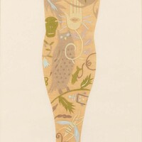
-

Hair Head (from the KALLIMA series)
"Hair Head, every bit as disorienting as Alex Kisilevich’s stare/trance related above, is part of a series entitled Kallima. Kallima is a genus of a mimetic butterfly. The word itself comes from the Greek ‘kali’ meaning beautiful. When in danger it mimics a dead leaf by drawing its wings together. Camouflage works by making the Kallima appear as one with the world, but at a cost. It loses its self-identity. The identity of the woman posing for her portrait is made problematic by dislocation: either she is facing forward (as suggested by her dress), her face disguised by a mop of hair or she is facing backwards (as suggested by the placement of her arms) and it is her dress that is front to back. Disguise is a sort of camouflage in so far as one is hoping to hide one’s identity. Hair Head presents itself as orthodox portraiture meant to reveal the identity, and perhaps character, of the sitter and this is what makes it so unnerving. The element of disguise turns the tradition on its head. The photographs of Alex Kisilevich abound in clever reconfigurings of everyday objects to produce new and often absurd meanings. Playfully blending medium and materiality, in his latest work Kisilevich extends his photographic practice, exploring the ideas of photograph as painting, photograph as sculpture and photograph as video." (David Phillips, Seneca Polytechnic) -
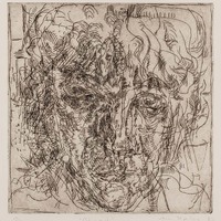
Head
"Kipling's approach to printmaking has been prodigious if unorthodox. Creating multiples of an image has been of little importance to her. Almost every edition is varied. Not only does an edition encompass various inkings, but different papers as well. The papers vary wildly in the earlier prints (1958-1961) and again in the earlier drypoints. Gradually, she narrowed it down to papers such as Rives BFK, and the later work from 1966 and 1967 is far more consistent as far as editioning goes. The editions are always small, usually less than 20 and often less than 10. The intaglio plates were occasionally inked with a roller and printed as one would print a woodcut. Because Kipling's working method usually involves completing a drawing or print in one session, there appear to be only two instances where impressions encompass more than one state, that is, where she has reworked the plate. The works are drawn directly on the plate and never based on preliminary drawings or sketches. Because of this, many proofs are unique and the artist seems to have deemed the plates unworthy of further printing. These lesser prints, nevertheless, provide interesting information on the Kipling’s working methods."